
Product Availability on Grainger.com
GOAL
Improve stock availability experience for 1.5M+ products on Grainger.com
TEAM
1 UX Designer (me) and 1 UX Researcher
DURATION
18 months
CHALLENGE
-
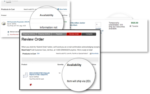
Stock availability messages during pre-order and post-order process were confusing and/or incomplete
-
Customer had to go through number of clicks and pages to check availability during the shopping process
-
Opportunity to improve search/browse to cart conversion through navigation enhancements


PROCESS
RESEARCH PROCESS SYNTHESIS DESIGN & VALIDATION

Reviewed 2 years of VOC feedback collected through customer service agents and customer facing employees

Reviewed 6 months of survey data where website visitors expressed their primary reason to visit the site is to check product availability
75
verbatims regarding product availability were received in last 6 months
8%
verbatims suggested availability messages were unclear
16%
verbatims suggested availability should be more readily displayed throughout search and browse paths
76%
verbatims suggested products are assumed unavailable
Audited the website and looked through 1000+ products to discover all scenarios with inaccurate/absence of availability information

Conducted competitive analysis of 7 other websites in similar market to identify availability information and features they offer
PROCESS
RESEARCH PROCESS SYNTHESIS & DESIGN VALIDATION & ITERATIONS
Reviewed 2 years of VOC feedback collected through customer service agents and customer facing employees
Reviewed 6 months of survey data where website visitors expressed their primary reason to visit the site is to check product availability
75
verbatims regarding product availability were received in last 6 months
8%
verbatims suggested availability messages were unclear
8%
verbatims suggested availability messages were unclear
Audited the website and looked through 1000+ products to discover all scenarios with inaccurate/absence of availability information
Conducted competitive analysis of 7 other websites in similar market to identify availability information and features they offer
Check out some other work
RESEARCH PROCESS SYNTHESIS DESIGN & VALIDATIONS

Identified all possible combinations across customer, delivery method, product type and stock status

Outlined experience journey to identify customer expectations and system exceptions through pre-order and post-order flow

Worked with supply chain, QA, product manager and copywriter to trim down messages by 35% (330 to 210 messages)
RESEARCH PROCESS SYNTHESIS DESIGN & VALIDATIONS
Designed and tested various alternatives that allow users to select ZIP code and delivery method on different pages throughout the site
DESIGN A

DESIGN B
DESIGN C


NEW PRODUCT AVAILABILITY MESSAGES


RESULT
Once availability was sorted, it gave birth to two new immediate projects:

Showing alternate products and branches if products in cart are out-of-stock

Ability to filter products by availability during the browse/search path